Wednesday 2 March 2016

memes presentation


WWW: I went into detail on memes, and explained how they represent our culture.
EBI: if i spoke on implicit and explecit messages.

Agenda Setting Presentation

WWW: I exaplained the theory pretty good.

EBI: I go into detail on more relevant and fitting examples.

Tuesday 10 November 2015

Viral Marketing Presentation

4 million people viewed the YouTube video in one week!

Biggest viral marketing campaign of 2013

Directed by Wilson Dougal. He has directed campaigns for John Lewis.

Went to the Shetland to audition ponies. They then saw socks. They said he oozed star quality.


The Pony Mixer is a web-based app that basically allows you to create your own dancing version of Socks. You didn't need to download anything you just had to go to ponymixer.com, then create your version. After doing so the audience was then encouraged to share it online.


Thursday 5 November 2015

Sound Analysis


SKIP THE FIRST 38 SECONDS

Goodfellas is thought to be the greatest film ever Directed by Martin Scorsese.

The sequence opens with a very creative title sequence; which shows the credits moving in sync to the sound bridge of vehicles. Scorsese merges both none diegetic, and diegetic sounds into this sequence, to add intrigue from the outset and to entice the viewer to question the art, questions like where the sounds are coming from?, and why did the director choose that moment to begin the film? Scorsese links both sections of this sequence by doing so. From this aspect of the sequence, it is shown that the film is fast paced and well-constructed. Which is very important for the audience to learn whether a film is worth watching.

The last 10 seconds of this clip also uses sound effectively over lapping narration and none diegetic sound, made even more effective by the shot selection. This sequence is where Henry Hill says ‘as far back as I can remember I’ve always wanted to be a gangster’, on the end of that sentence the camera zooms in to almost make the audience take a look into Hill’s life, on the back of the sentence, the music begins marking that moment as an important one. The music played captures the age of the film, building up to at the climactic moment where Hill stars into the distance.


This sequence is extremely ambiguous towards the end, because the music paints the brutal murder as something to be celebrated. From this clip I would assume the genre of the film as being an action with a hint of comedy due to the sound.

Wednesday 18 March 2015

Saturday 7 March 2015

Progression


This image would be second to be officially released.

From the feedback I got on this image I re-edited it with all those things in mind. I chose to manipulate this image. To focus the audiences eyes around  the tip of the gun.


This image would be released as a teaser, Close to the release of the film.

Originally this wasn't an image. It was a video. I was editing the video footage and I paused it, and I liked where it stopped. I thought that image would make a good poster so I edited, rotated, and cropped it.

I wanted to use levels in the making of this image, but in an unconventional way. I've put the image at an angle to give the effect that the female is in a higher position, and she's having to come down to reach that of the males. In the film this becomes more clear. I've purposely taken this image in contrast with the other two. The other two images portrays the male as a powerful character. But this image is different, it takes the campaign into a different direction. Further building the story and the mystery to the campaign.

I got the inspiration from this poster. I think the face in the middle of the shot makes the space around him interesting, and that's why its a wide shot.


Tuesday 24 February 2015

Advertising Poster 1

Advertisng campaign number 1. Official poster. 


I have made the image clearer, re-edited the font and the text. I've slightly stripped back the superlatives, and kept the ones that would be realistic to a new film of this type of drama. Compare both and see the detail changes I've attempted to make.

I've arguably chosen vogue as a superlative. This poster seems gritty and urban and nothing to do with fashion, yet the females shirt is highlighted this shows a lot of thought has gone into the costumes and that is the link with vogue because vogue operates in fashion. This implies this isn't just an urban black people killing each conventional drama. It  illustrates there is more than one ideology in it. which causes it to become interesting and unconventional.

I chose to highlight the colour red because it is such a good colour to use in posters like these. That aspect is conventional. Red can be used as a passionate colour just as much as it can be used as a dangerous colour. In this poster I like to think, I used it in both ways (just like the Four Brothers poster)

The layout is simple I used a lot of the structure from the Submarine poster I spoke on.

I used eye contact in this image because I like eye contact in images. It brings the audience into the photo, the fact that I placed the camera between the legs of the boy looking right at the girl shows the perspective of that boy.

What I wanted to capture in this image was normalness. Just a girl walking down a street but then confronted by someone which brings her to an abrupt stop. The girls frozen foot portrays this perfectly.

Thursday 12 February 2015

PRINT WORK "POINT BLANK"

I've taken what I think works from each poster and merged it into my print work.
I've also actually incorporated my actual Silverlining Productions logo in it, to try make it look as professional as possible. I know some of the font may be hard to read, but that's the way it is.


Tuesday 10 February 2015

Print Inspiration


I will be basing my print coursework on the posters of the films: Four Brothers, Get Rich or Die Tryin’ (GRoDT) and Submarine. I’ve chose these films because all three films use different design strategies, and all strategies are affective. Four Brothers uses a very simple way of designing there posters, but is very effective, this is similar GRoDT they both use similar design techniques using the colour red to communicate what they want the audience to know, while Submarine uses a deeper thinking design with quotations. I think finding an advertising area between all three will be a good target because the film I am doing is a youth drama similar to GRoDT, but I’m hoping to add a different side to it and not just black kids killing each-other.
 

Four Brothers is a film about four adopted boys, who grew up with their foster mother. As the years go on the boys turn to men and grow apart, only to be brought back together due to their foster mothers murder. The four men then pledge to avenge her death by killing the people who murdered her. The posters allows the audience to know the foster mother gets murdered, this causes the audience to wonder why, in doing so the audience form an interest in it, and makes them want to see what happens. This poster also uses levels. The camera is placed at the brother’s feet with them looking down, it shows that they are the most powerful in the picture, this also depicts the masculinity of the brothers. The word ‘brothers’ is in red, red is seen as a passionate dangerous colour. This makes sense with the text ‘they came home to bury their mother, and her murderer’.

Submarine is a film about a very weird boy, and his story about going out with the girl he fancies, while his trying to figure out whether his moms having an affair. This is a very smartly directed, smartly written film. This smart quality is used in the posters the posters because they use colours to signify different things. My first reaction to watching the film was “this film has nothing to do submarines”, the only reference to an actual submarine is in this poster. Where a section of the poster is coloured in blue (what I assume must be signify water) and half of the boy’s face is submerged. As if it is saying his struggling to stay afloat, which can reflect his status in the film. I like this. Using parts of the design that makes the audience think, but without over complicating it.
 

Get Rich or Die Tryin’ is a film about an orphan (Marcus) left alone after his mother’s mysterious murder, and his father’s disappearance. Marcus is then taken in by his uncle’s family, as the child. As he grows he desires more and enters the world of drug dealing, he works his way up the ladder until his in the company of the city’s biggest gangsters, with this comes many problems.  This status also helps Marcus find his father, the person who murdered his mother, and the reason why. Marcus is played by the world famous rapper 50 cent, the poster uses this to its advantage almost like a celebrity endorsement they use 50 cents real name ‘Curtis’ and his stage name to make sure the audience are aware who it is. This poster also uses similar colours to four brothers. The only colour on the poster is the colour red. In red is the text “Get Rich or Die Tryin’”, this plays almost the exact role of the four brothers “they came home to bury their mother, and her murderer”, a strong passion and a danger. In this poster 50 cent is shown gripping on to a child as he gazes directly into the camera the zeitgeist of this time is that people love babies, and the fact that 50 cent is holding one makes the audience emphasise with him, and wants to watch the film to see his journey. This is all through eye contact.


Wednesday 7 January 2015

Youthful Advertising 1


Teaser advertisement campaigns are used to show the public what the show is about and the target audience they are aiming it at. A teaser advertisement doesn't reveal a lot about the product, but the things that are important and will cause a hunger for their product, with hopes that the viewers will be enticed to watch the programme. The purpose of this is to arouse widespread attention, and build excitement and expectations through consumer curiosity.

 This advertisement is highly sexualised, this instantly gives the impression that it is aimed at a young audience, because the elderly don’t generally like sexual things. Youth is portrayed by the texture of background of the E4 logo and the programme information. It is scrunched showing its imperfect, and I’m assuming the designers of this wanted the viewers to link the programme and the imperfection aspect. This and this highly sexualised picture.

Monday 15 December 2014

Audience

The audience to Point Blank according to the brief (Silver Ling productions)  is 15-35, but I've noticed the age of watching these programmes are falling. So realistically the target audience will be aged between: 11-35. My product will be urbanized, similar to channels 4’s Top Boy, so going into more detail it will be aimed at those who enjoy watching gangster programmes, or live in urban areas and like to imagine the fantasy. My product will hopefully have a a mixed gender audience 

This product will be shown pre-watershed. Although Top Boy is post-watershed, and swearing is a large part of it. Strong language is used in expression and to illustrate the grittiness of the inner city areas, and it works for Top Boy. Also sexual scenes Top Boy shows clips of their intimate scenes, to show a visual. But I think I can direct my product in such a way it will remain effective without strong language and sexual scenes.

My target audience like these types of programmes because they can relate to it. While others like to think they can. Either way they enjoy programmes of this genre.

logos

This is my final logo. I tried to construct a business identity by using that aspect of the Pixar’s logo I spoke on in research 2. With this logo I tried to go against the main conventions of movie production logos.


The man’s silhouette is insignificant just like how I interpreted the boy in the Dream Works logo, this aspect will hopefully make this logo memorable. I also tried to incorporate a hint of conventionalism with how high the logo is, representing the quality of the product.


I don’t like this logo. It isn't very nice to look at, but it is simple, effective, and represents silver lining productions. I designed this to be seen as the bringer of something good. Which is why the actual “Silver Lining Productions” writing is around the sun which is just emerging from wet weather.


This is safe.


Wednesday 10 December 2014

RESEARCH 2


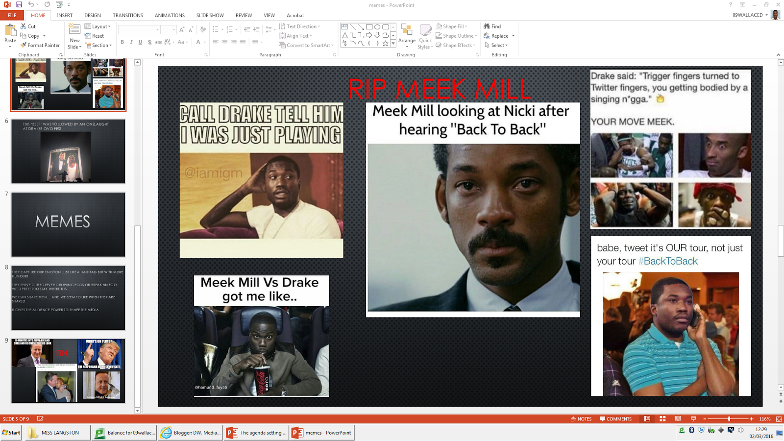
These logos are significant to my research, although the purpose of me having them here are not to admire how it represents the businesses product, but to analyse how their logos create an identity for the business. An identity I think goes hand in hand with the business product.

These logos tell the viewer(s) nothing about their product other than it is very creative. For example the Pixar logo. What is seen is the word ‘Pixar’ on a blue-ish background, with the ‘I’ replaced with a lamp, what is meant I see is the creativity of Pixar. Dream Work’s logo is of a boy on the moon. Fishing.  What is meant again I think is creativity. I cannot see how this represents animations yet it is very well known due to this unique factor.

Pixar work in the animation industry, they have produced films such as Toy Story and Finding Nemo, and these are seen as some of the best animation movies ever made. The still Pixar logo doesn’t represent animation. It doesn’t follow the conventional way of film logos for example incorporating the photographic film, or some sort of 60’s camera in their logo. This factor makes the logo unconventionally interesting, this element causes the logo to be memorable, creating an identity for the business. I could use this in the creation for the Silver Lining logo, because it won’t be known, so for it to be a successful logo I would need to make it interestingly different. The Dream Works logo is unique in this way also, the designers smartly made the logo avoiding focusing on the individuals like the boy or the moon, but the entire concept of the boy on the moon, this can be seen as unlimited creativity and showing how good of film makers they are, to further back this up it can be proven through the fact that Dream Works are so high up there’s nothing that can compete with them, this shows their dominance on the animation industry. Coming from this point, creativity is also shown, by the boy on the moon fishing. This is impossible but the reality that he can still be there shows how Dream Works look at things.

Although neither Pixar nor Dream Works represents the product they are trying to sell. They create a brand identity. I want to capture this in the creation of the silver linings logo.   


Friday 5 September 2014