Wednesday, 25 November 2015
Tuesday, 10 November 2015
Viral Marketing Presentation
4 million people viewed the YouTube video in one week!
Biggest viral marketing campaign of 2013
Directed by Wilson Dougal. He has directed campaigns for
John Lewis.
Went to the Shetland to audition ponies. They then saw
socks. They said he oozed star quality.
The Pony Mixer is a web-based app that basically allows you
to create your own dancing version of Socks. You didn't need to download
anything you just had to go to ponymixer.com, then create your version. After doing
so the audience was then encouraged to share it online.
Thursday, 5 November 2015
Sound Analysis
SKIP THE FIRST 38 SECONDS
Goodfellas is thought to be the greatest film ever Directed
by Martin Scorsese.
The sequence opens with a very creative title sequence;
which shows the credits moving in sync to the sound bridge of vehicles. Scorsese
merges both none diegetic, and diegetic sounds into this sequence, to add
intrigue from the outset and to entice the viewer to question the art,
questions like where the sounds are coming from?, and why did the director
choose that moment to begin the film? Scorsese links both sections of this sequence
by doing so. From this aspect of the sequence, it is shown that the film is
fast paced and well-constructed. Which is very important for the audience to
learn whether a film is worth watching.
The last 10 seconds of this clip also uses sound effectively
over lapping narration and none diegetic sound, made even more effective by the
shot selection. This sequence is where Henry Hill says ‘as far back as I can
remember I’ve always wanted to be a gangster’, on the end of that sentence the
camera zooms in to almost make the audience take a look into Hill’s life, on
the back of the sentence, the music begins marking that moment as an important
one. The music played captures the age of the film, building up to at the
climactic moment where Hill stars into the distance.
This sequence is extremely ambiguous towards the end,
because the music paints the brutal murder as something to be celebrated. From this
clip I would assume the genre of the film as being an action with a hint of
comedy due to the sound.
Tuesday, 23 June 2015
Thursday, 11 June 2015


Wednesday, 18 March 2015
.jpg)
Saturday, 7 March 2015
Progression

This image would be second to be officially released.
From the feedback I got on this image I re-edited it with all those things in mind. I chose to manipulate this image. To focus the audiences eyes around the tip of the gun.

Originally this wasn't an image. It was a video. I was editing the video footage and I paused it, and I liked where it stopped. I thought that image would make a good poster so I edited, rotated, and cropped it.
I wanted to use levels in the making of this image, but in an unconventional way. I've put the image at an angle to give the effect that the female is in a higher position, and she's having to come down to reach that of the males. In the film this becomes more clear. I've purposely taken this image in contrast with the other two. The other two images portrays the male as a powerful character. But this image is different, it takes the campaign into a different direction. Further building the story and the mystery to the campaign.
I got the inspiration from this poster. I think the face in the middle of the shot makes the space around him interesting, and that's why its a wide shot.
Tuesday, 24 February 2015
Advertising Poster 1
 Advertisng campaign number 1. Official poster.
 I've arguably chosen vogue as a superlative. This poster seems gritty and urban and nothing to do with fashion, yet the females shirt is highlighted this shows a lot of thought has gone into the costumes and that is the link with vogue because vogue operates in fashion. This implies this isn't just an urban black people killing each conventional drama. It illustrates there is more than one ideology in it. which causes it to become interesting and unconventional.
I chose to highlight the colour red because it is such a good colour to use in posters like these. That aspect is conventional. Red can be used as a passionate colour just as much as it can be used as a dangerous colour. In this poster I like to think, I used it in both ways (just like the Four Brothers poster)
The layout is simple I used a lot of the structure from the Submarine poster I spoke on.
I used eye contact in this image because I like eye contact in images. It brings the audience into the photo, the fact that I placed the camera between the legs of the boy looking right at the girl shows the perspective of that boy.
What I wanted to capture in this image was normalness. Just a girl walking down a street but then confronted by someone which brings her to an abrupt stop. The girls frozen foot portrays this perfectly.
Thursday, 12 February 2015
PRINT WORK "POINT BLANK"
I've taken what I think works from each poster and merged it into my print work.
I've also actually incorporated my actual Silverlining Productions logo in it, to try make it look as professional as possible. I know some of the font may be hard to read, but that's the way it is.


I've also actually incorporated my actual Silverlining Productions logo in it, to try make it look as professional as possible. I know some of the font may be hard to read, but that's the way it is.
Tuesday, 10 February 2015
Print Inspiration
I will be basing my print coursework on the posters of the
films: Four Brothers, Get Rich or Die Tryin’ (GRoDT) and Submarine. I’ve chose
these films because all three films use different design strategies, and all
strategies are affective. Four Brothers uses a very simple way of designing
there posters, but is very effective, this is similar GRoDT they both use
similar design techniques using the colour red to communicate what they want
the audience to know, while Submarine uses a deeper thinking design with
quotations. I think finding an advertising area between all three will be a
good target because the film I am doing is a youth drama similar
to GRoDT, but I’m hoping to add a different side to it and not just black kids
killing each-other.
Four Brothers is a film about four adopted boys, who grew up
with their foster mother. As the years go on the boys turn to men and grow
apart, only to be brought back together due to their foster mothers murder. The
four men then pledge to avenge her death by killing the people who murdered her.
The posters allows the audience to know
the foster mother gets murdered, this causes the audience to wonder why, in
doing so the audience form an interest in it, and makes them want to see what
happens. This poster also uses levels. The
camera is placed at the brother’s feet with them looking down, it shows
that they are the most powerful in
the picture, this also depicts the masculinity of the brothers. The word ‘brothers’ is in red, red is
seen as a passionate dangerous
colour. This makes sense with the text ‘they came home to bury their mother,
and her murderer’.

Submarine is a film about a very weird boy, and his story
about going out with the girl he fancies, while his trying to figure out
whether his moms having an affair. This is a very smartly directed, smartly
written film. This smart quality is used in the posters the posters because
they use colours to signify different things. My first reaction to watching the
film was “this film has nothing to do submarines”, the only reference to an
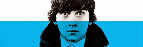
actual submarine is in this poster. Where
a section of the poster is coloured in blue (what I assume must be signify
water) and half of the boy’s face is submerged. As if it is saying his struggling
to stay afloat, which can reflect his status in the film. I like this.
Using parts of the design that makes the audience think, but without over
complicating it.

Get Rich or Die Tryin’ is a film about an orphan (Marcus) left
alone after his mother’s mysterious murder, and his father’s disappearance.
Marcus is then taken in by his uncle’s family, as the child. As he grows he
desires more and enters the world of drug dealing, he works his way up
the ladder until his in the company of the city’s biggest gangsters, with this
comes many problems. This status also
helps Marcus find his father, the person who murdered his mother, and the
reason why. Marcus is played by the
world famous rapper 50 cent, the poster uses this to its advantage almost like
a celebrity endorsement they use 50 cents real name ‘Curtis’ and his stage
name to make sure the audience are aware who it is. This poster also uses
similar colours to four brothers. The only colour on the poster is the colour
red. In red is the text “Get Rich or Die
Tryin’”, this plays almost the exact role of the four brothers “they came home
to bury their mother, and her murderer”, a strong passion and a danger. In
this poster 50 cent is shown gripping on to a child as he gazes directly into
the camera the zeitgeist of this time is that people love babies, and the fact
that 50 cent is holding one makes the audience emphasise with him, and wants to
watch the film to see his journey. This is all through eye contact.

Wednesday, 7 January 2015
Youthful Advertising 1

Teaser advertisement campaigns are used to show the public
what the show is about and the target audience they are aiming it at. A teaser advertisement
doesn't reveal a lot about the product, but the things that are important and
will cause a hunger for their product, with hopes that the viewers will be
enticed to watch the programme. The purpose of this is to arouse widespread
attention, and build excitement and expectations through consumer curiosity.
This advertisement is highly sexualised, this instantly gives the impression that it is aimed at a young audience, because the elderly don’t generally like sexual things. Youth is portrayed by the texture of background of the E4 logo and the programme information. It is scrunched showing its imperfect, and I’m assuming the designers of this wanted the viewers to link the programme and the imperfection aspect. This and this highly sexualised picture.
This advertisement is highly sexualised, this instantly gives the impression that it is aimed at a young audience, because the elderly don’t generally like sexual things. Youth is portrayed by the texture of background of the E4 logo and the programme information. It is scrunched showing its imperfect, and I’m assuming the designers of this wanted the viewers to link the programme and the imperfection aspect. This and this highly sexualised picture.
Subscribe to:
Comments (Atom)